Playing To Win
Strategic Breadcrumb Spacing
Never Violate the Hansel & Gretel Rule

There is truly an impressive amount of wisdom in the Brothers Grimm fairy tales. Think too about their stunning productivity in creating a string of iconic characters from Cinderella to Rapunzel to Sleeping Beauty to Snow White. But the subject for today is the business wisdom of another of their literary creations, Hansel & Gretel. To that end, the topic of my 28th Year II Playing to Win/Practitioner Insights (PTW/PI) is Strategic Breadcrumb Spacing: Never Violate the Hansel and Gretel Rule. You can find the previous 80 PTW/PI here.
The Story
For those not entirely familiar, in the Hansel and Gretel fairy tale, a brother and sister need to escape deep dark forest to avoid being eaten by an evil witch who lives in a gingerbread house!? Their method of finding their way out of the forest is to leave a trail of breadcrumbs behind them. In fact, a trail of white pebbles actually worked the first time, while the breadcrumbs didn’t work the second time because the birds ate them. But since white pebbles are boring and breadcrumbs are cool, the point of the story has become to leave a trail of breadcrumbs to guide you along any challenging pathway (plus, watch out for gingerbread houses — but I digress).
Human Nature
The Brothers Grimm have made an outsized impact on the world because their stories echoed key aspects of human nature. In this case, the link is from a trail of breadcrumbs to the love of the human subconscious for the comfort generated by familiarity. Brain research over past couple of decades has made it abundantly clear that our subconscious really hates being jerked out of its comfort zone. Our subconscious likes to get comfortable that something works and with how it works. It then wants very badly to keep doing that thing. So, if Tide got your clothes clean and white the past 50 times you used it, your subconscious will want you to buy Tide the next time you are in your retailer of choice. Your subconscious will be miffed if Tide is out-of-stock. And it will be flat-out angry with your conscious if because you saw an ad for Persil, you decided to give that a try instead. It hates dramatic change and tries to stop it from happening if possible.
The subconscious’ lust for familiarity is behind why your trench coat has buttoned shoulder flaps and your blue jeans have metal rivets. The actual utility of those features ceased to be relevant around a century ago — unless of course you need to make certain that your rifle strap doesn’t slip from your shoulder as you go to battle in your Burberry or your Levi’s won’t pull apart while you are panning for gold — but each helps signal familiarity to the subconscious viewing it, and that is comforting. Visual first impression holds outsize importance for the subconscious. With the subconscious there most certainly isn’t a second chance to make a first impression! That is why package color is so important in consumer-packaged goods — you see the color before you can read the lettering — and why graphic user interface is so important online.
Shoulder flaps and rivets are, in the technical jargon for this sort of thing, skeuomorphs. They create a link to the past, in essence, help place the breadcrumbs close enough together to keep the subconscious happy that the trench coat and jeans look ‘the way they should.’ Skeuomorphs are even used in entirely new products, like websites that feature digital shopping cart icons. What does a shopping cart have to do with buying products on a digital platform? Nothing other than contributing to user comfort. These skeuomorphic features have one goal in mind: to appeal to the subconscious’ lust for familiarity.
The Big Fail
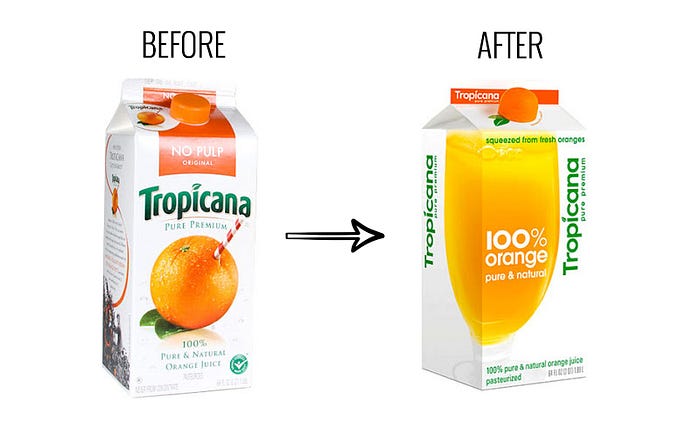
Despite the increasing level of clarity about the role of the subconscious in favoring familiarity, many business executives, product designers and marketers just don’t get it. They keep attempting to create ‘breakthrough’ changes because they believe that is what sells. There are of course, horror stories of failure due to shocking in the subconscious into fleeing, such as the 2009 Tropicana carton redesign disaster (pictured below).
My personal bugaboo is the Holiday Inn logo. I grew up staying at Holiday Inns on family trips and came to love the original and iconic 1952 logo below. My subconscious didn’t love the switch to the 1983 logo, but it was close enough. And the further step to the 2003 logo was still OK: not awesome but not repulsive. My subconscious could follow the breadcrumb trail from one to the next. Then boom! Along came the 2007 logo. My subconscious hated it. That breadcrumb was put so far away, it was over my horizon line. Every time I see that logo (or its 2016 cousin) I am instinctively revolted. To my subconscious, the folks at parent company IHG took away Holiday Inn and replaced it with something that just isn’t Holiday Inn.

This keeps happening as if it is some kind of mystery — when it isn’t. There is a way to guarantee failure and it is being used repeatedly. Let me use autos as an example. In 1998, Daimler-Benz and Swatch launched a new vehicle with enormous hope and fanfare. It was the Smart micro car.
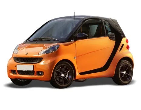
It was a very expensive flop and reportedly never lost less than $500 million in any year of its existence. It was introduced to America in 2007 and axed in 2019 having never sold 25 thousand per year in the market and 1,276 in 2018. It sold more in Europe but eventually failed there too and is now being relaunched as an all-electric vehicle for the Chinese market.
Despite huge financial investment and top-pedigree supporter, why was it such a failure? It didn’t either look like a car or feel like a car. The collective subconscious rejected it out of hand — including mine. When I was Dean of Rotman, I met the then President of Mercedes-Benz Canada who insisted that I test drive a Smart and gave me one to use for a week. As part of the test, I was given a lavish briefing on the vehicle including its stellar safety rating (and the industrial design behind it). That notwithstanding, every time I drove it on one of the city’s expressways, my subconscious was screaming at me: you idiot; we are going to die!
Could users have gotten to the point at which their subconscious would have accepted the Smart as a car? I believe the answer is yes. But it would have happened only at the end of a trail of breadcrumbs that gently moved the users from their existing definition of ‘what a car looks/feels like’ to the Smart being a ‘real car.’ Mercedes-Benz didn’t and car buyers never picked up the first breadcrumb.
The same thing happened with the i3, BMW’s 2014 model year launch of an all-electric car. Automotive engineers and designers have been positively giddy about the freedom that has been created by the new all-electric format. The chassis is a skateboard with small motors at each wheel and a flat battery pack sitting on the skateboard. That means that a vehicle no longer needs a number of the prominent physical features of a classical internal combustion engine vehicle — e.g., a hood for an engine at the front, a hump for the drivetrain down the middle, a bulky transmission and big gas tank. All of that can be tossed, enabling completely new silhouettes. The hood can be removed entirely, and the driver moved to the front of the vehicle, for example. It is all so cool!
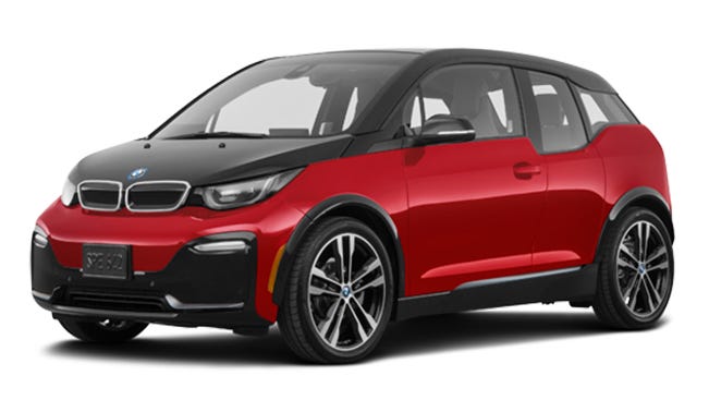
The BMWi3 was another economic disaster; canned in 2021 after sales of 1,052 in 2020. Even in friendly reviews, it was lovingly referred to as “quirky” and “kooky.” My wife and I first saw it in a big display in the hotel lobby of the Sofitel at Heathrow Terminal 5, at the base of a long escalator. My car-loving, Porsche-driving wife’s immediate reaction when she saw it was: “What is that stupid-looking thing?” The bottom line is that it didn’t look at all like a BMW or any other car. The subconscious doesn’t want either kooky or quirky. Auto geeks could enumerate all the reasons why this wasn’t a compelling vehicle technically, and I don’t quibble with any of them. But the breadcrumbs were so far apart that it had no chance.
A Different Approach
So, with that freedom to create a brand-new silhouette, as with the BMW i3, how do the initial vehicles from by far and away the world’s most successful electric vehicle company look? Like this:

It is virtually impossible to tell the difference between these vehicle silhouettes and your average successful luxury sedan. That is the radical, game changing, rule breaking new entrant, Telsa. Those design breadcrumbs are so close that they virtually touch one another. That helps keep the subconscious from getting freaked out by numerous bigger dislocations — a new propulsion system offered by a new company through a different distribution system with something as big as a TV screen as the console and over-the-air (OTA) updates, to mention but a few.
To counteract all of those scary things, Tesla delivered a subconscious-calming visual design — a first impression that reassures the subconscious that this isn’t a scary step along the breadcrumb trail. This was positively brilliant of Tesla. It makes the Tesla Cybertruck all the more baffling:
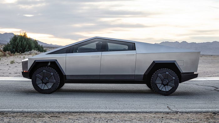
It is so foreign it freaks out my subconscious just looking at a picture of it. For all I know, it might just be the concept vehicle design and the final design will not be, well, freakishly scary.
Contrast this with the Ford F150 Lightning, the all-electric variant of the best-selling F150 full-sized pickup truck.
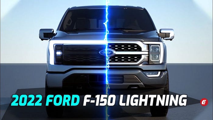
Not only are the breadcrumbs actually touching one another, the ad copy firmly reassures the subconscious of the current F150 owner: if you are contemplating being worried about the Lightning, don’t be. And it appears to be working. With reservations far exceeding the most optimistic estimates, observers are judging the introduction of the Lightning to be “insanely successful.”
Practitioner Insights
Next time you are pushed to be bold, don’t be afraid of boldness itself. Just make sure you place the breadcrumbs close enough together. If you are asked to approve a Smart car, BMWi3 or Cybertruck (in current form), just say no. But indicate you are highly supportive of laying a trail of breadcrumbs to guide the user along the path to the desired end. However, steadfastly refuse to allow the breadcrumbs to be placed so far apart that failure will be certain — and everyone involved will be eaten by the evil witch!
